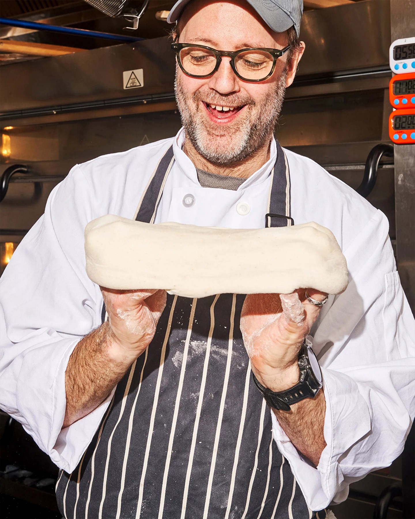
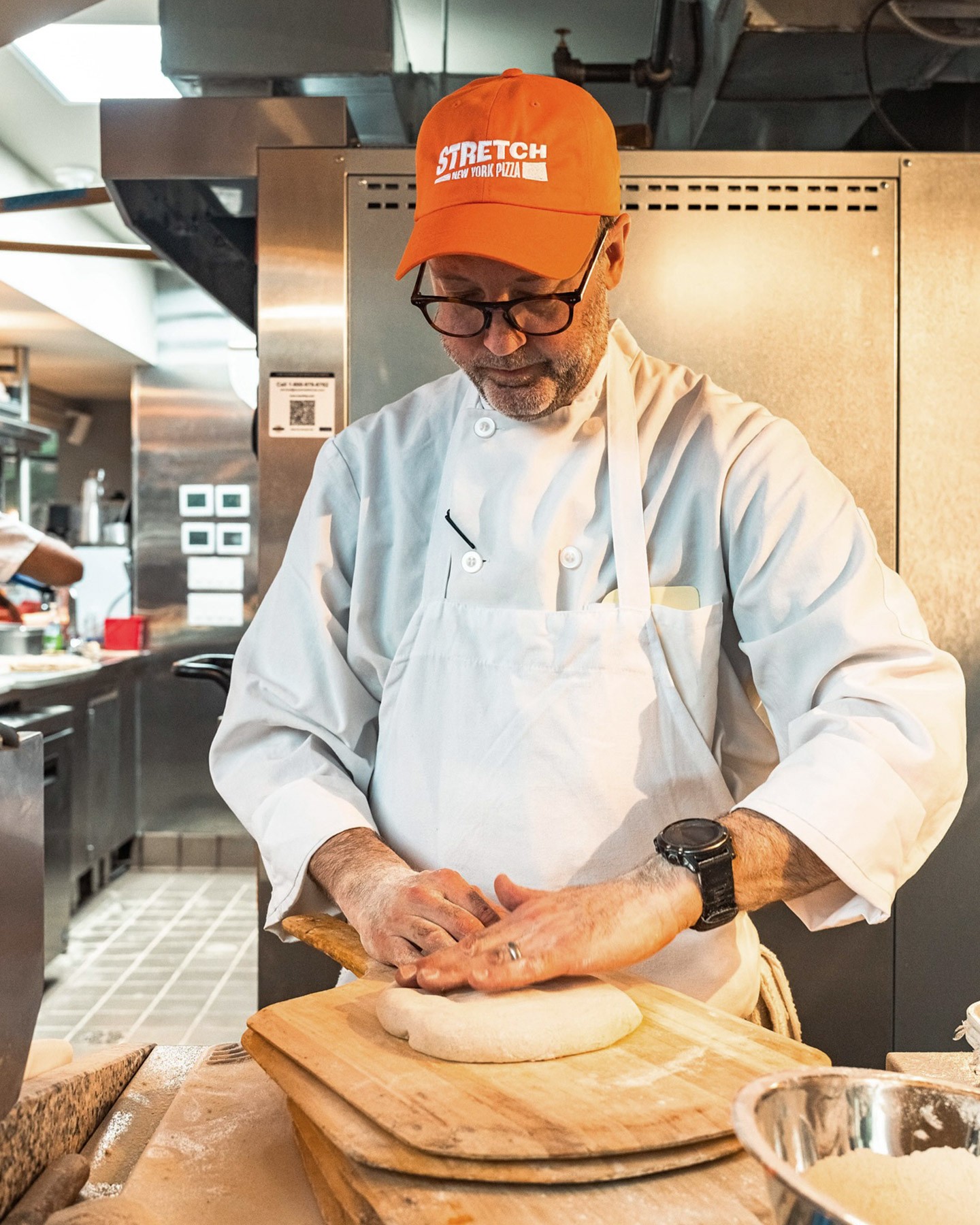
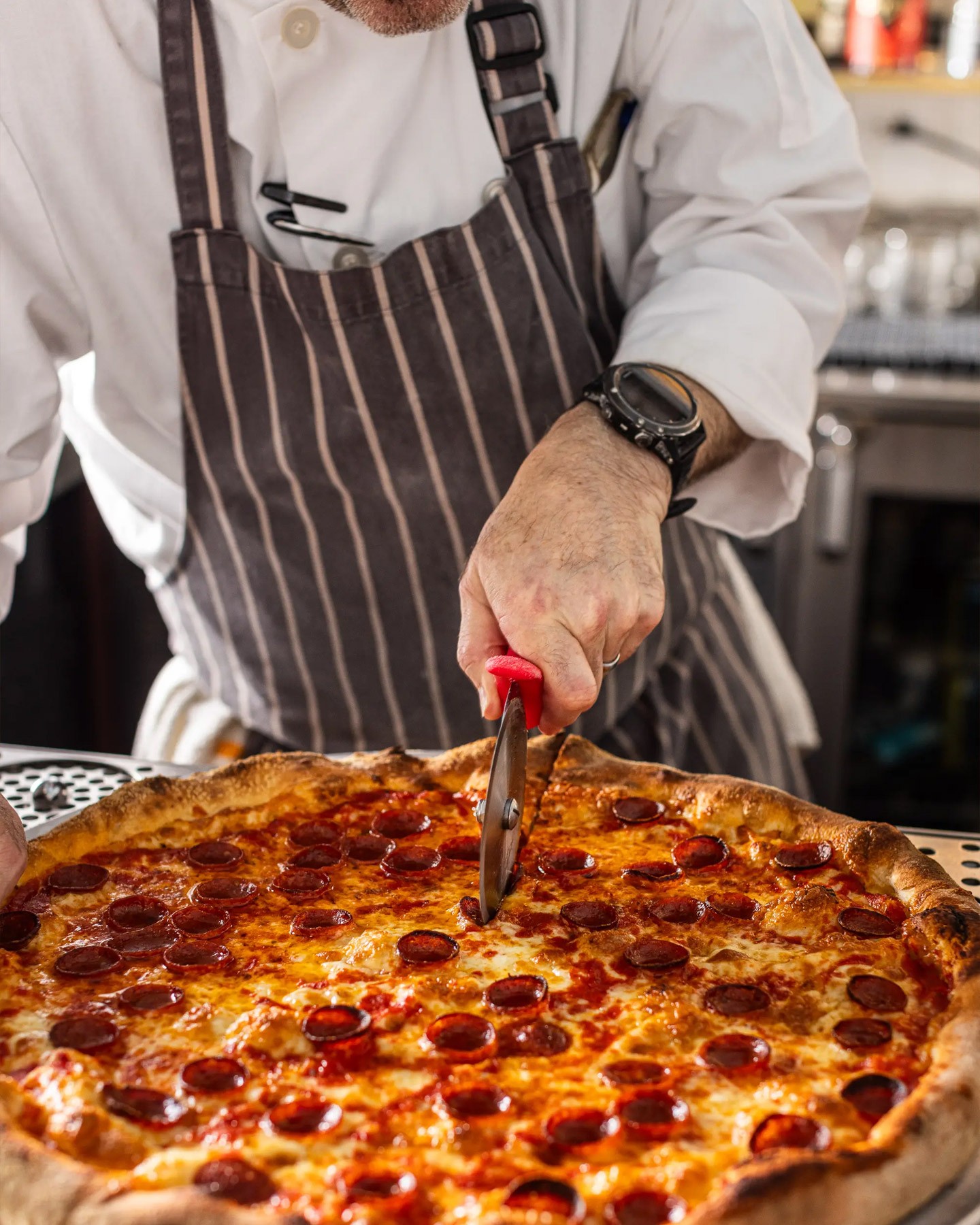
The brief was to celebrate New York pizza without leaning on nostalgia. The identity needed to carry the credibility of a chef-led kitchen while staying loose, welcoming, and authentic to New York. We kept the energy but made it more precise.
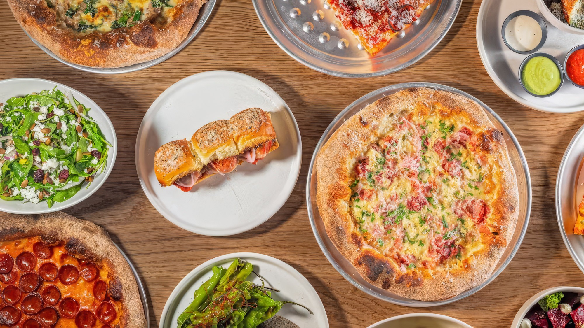
High-dining concepts FOR A NEW YORK slice
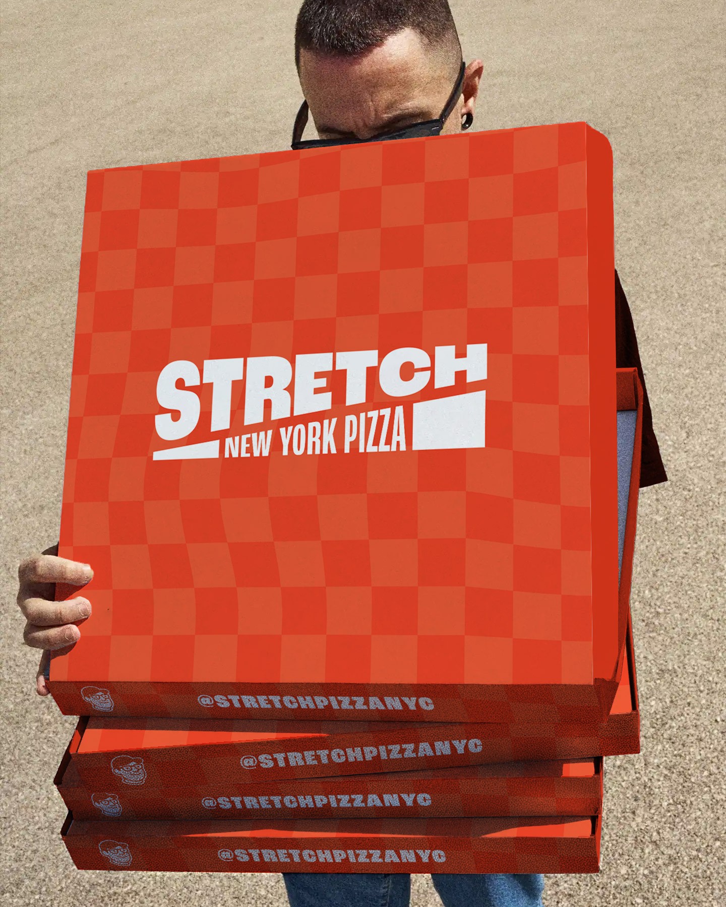
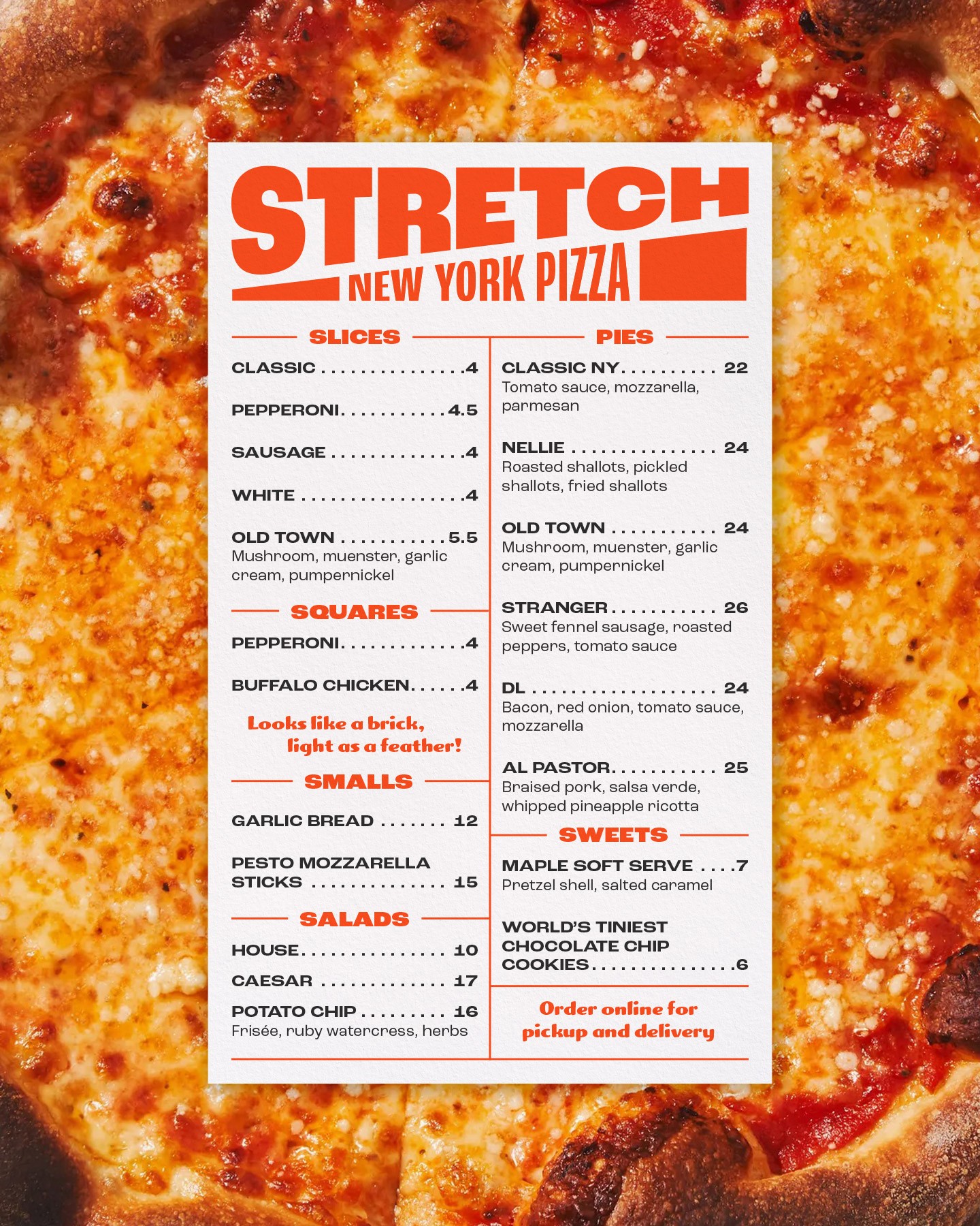
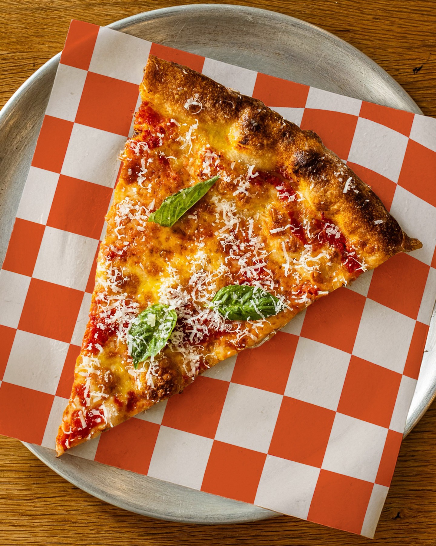
We redrew the wordmark and built a more dynamic typographic system. The color became brighter and more confident. The classic pizzeria checkerboard was stretched and warped, a nod to how Dufresne likes to twist the familiar (see the Everything Bagel Pizza). That motif runs through packaging, menus, signage, and the website, holding the identity together across formats.
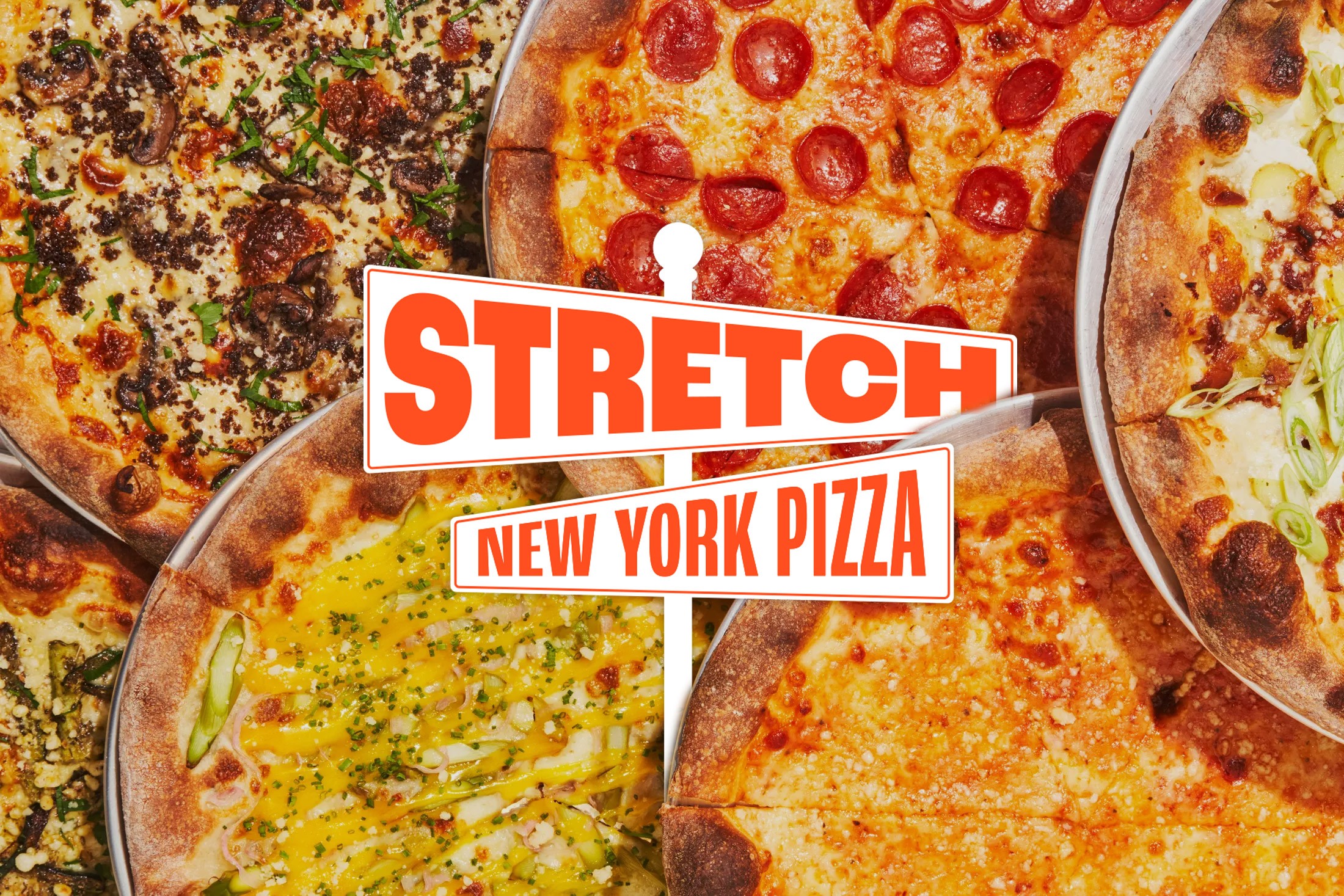
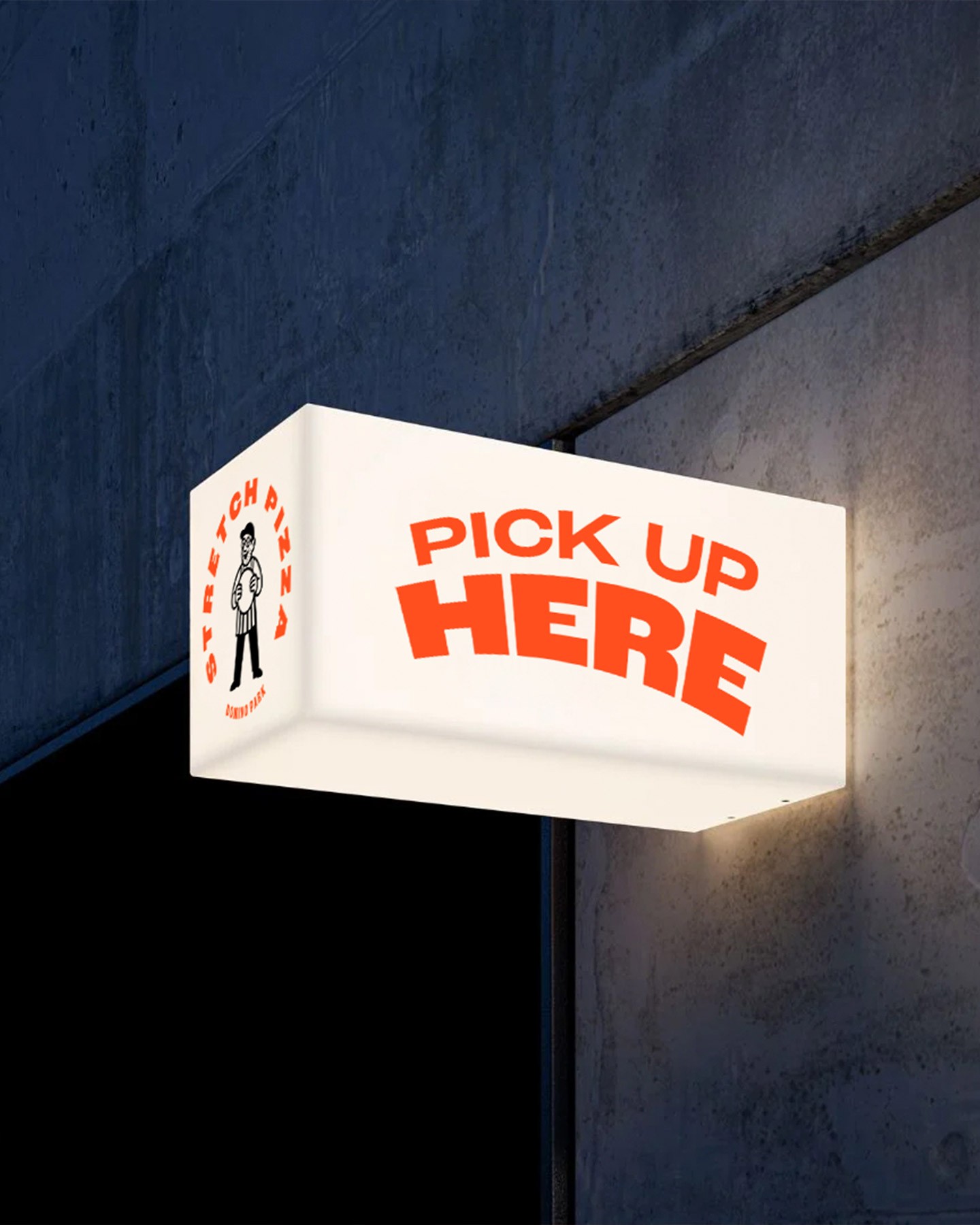
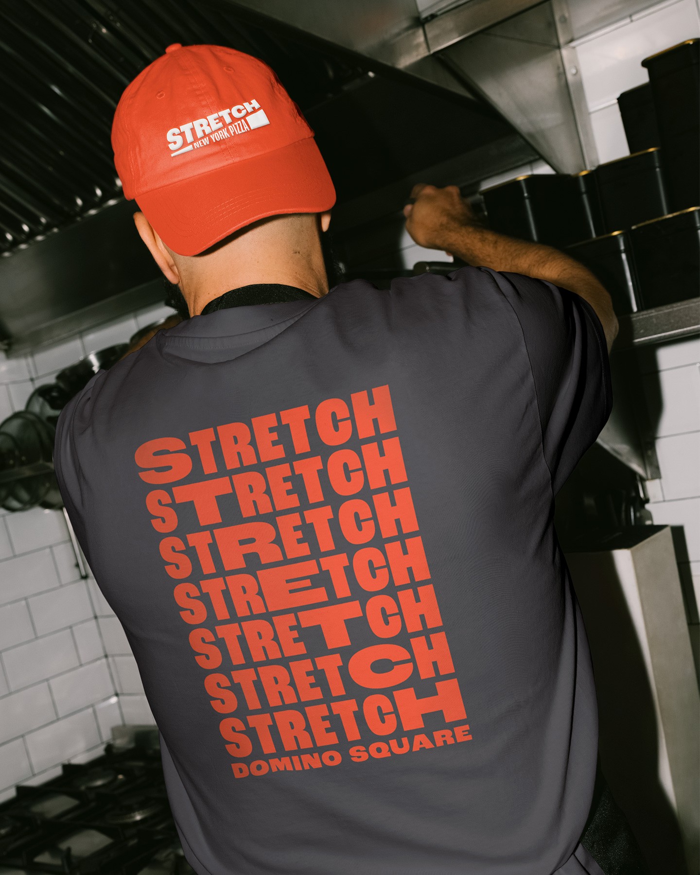
The rebrand gave Stretch a clearer voice and a stronger presence. Bold type and color that read from the street, a system that held together across storefronts, packaging, and digital, and a tone that carried Dufresne's precision without losing the fun.