
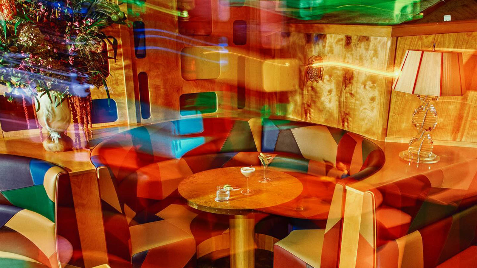
The identity needed to hold the restaurant’s intensity without slipping into parody. We focused on a palette and typographic system that could stand up to the room’s energy and still feel deliberate and elevated.
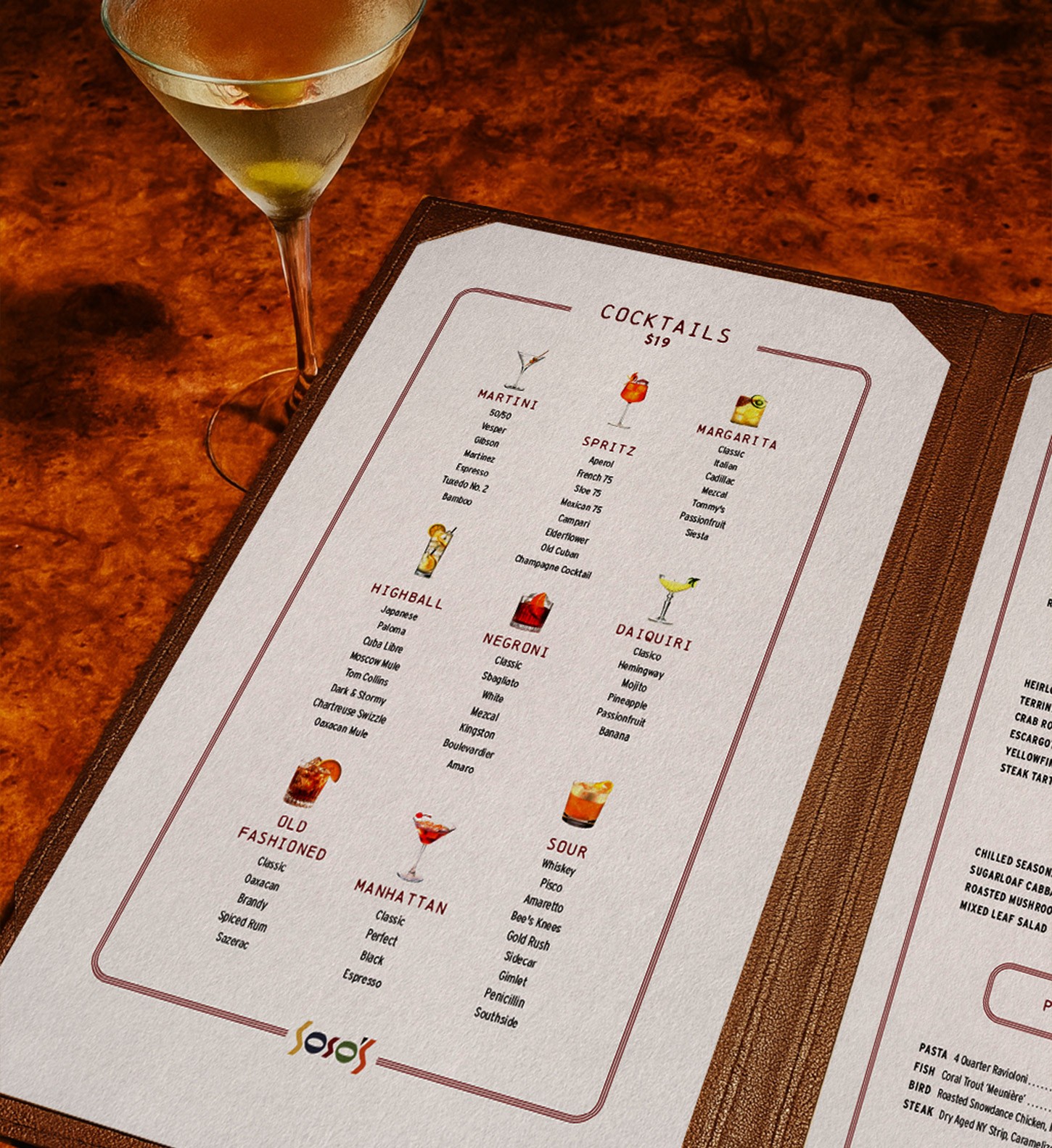
Supper was brought in to create a full brand experience built from the ground up, including menus, signage, uniforms, and printed pieces that match the unapologetic tone of the space. The operators wanted a brand that captured the life of the interiors, gave the restaurant a strong and lasting presence, and felt instantly recognizable.

"This is not the place for subtlety."
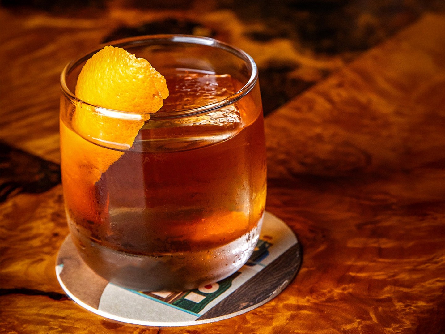
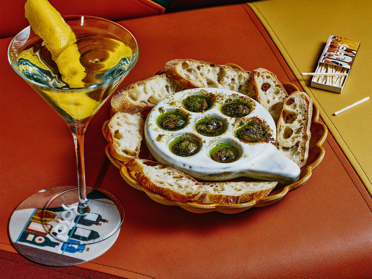
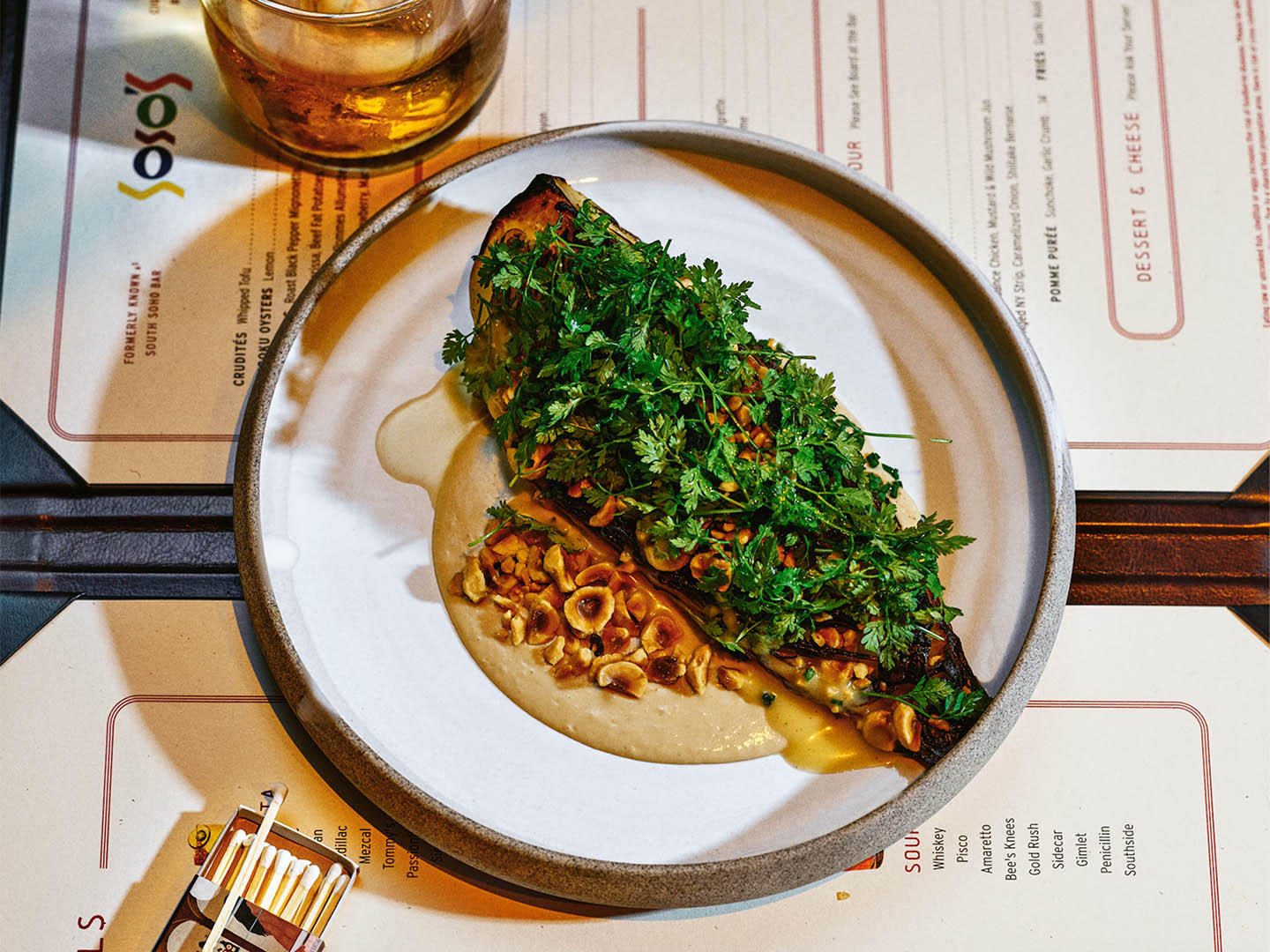
That was the brief. With that instruction in mind, the identity was built to be bold. It leaned into saturated colors, custom typography, and details that feel lived-in and soulful. Menus were structured on traditional brasserie grids and finished with custom leather covers, the logo was crafted from two typefaces that gave it structure and flair. Photography was treated to feel vintage yet fresh, and artwork from the dining room, like Scout Zabinski’s semi-nude painting, found its way onto coasters, matches, and other guest touchpoints.


The evolved system helped the team shift naturally from cocktail bar to full dining room, giving the space a look and rhythm that feels fully realized. It is vibrant, confident, and layered, tying every element back to the dining room itself. Supper developed the full system from top to bottom, creating a brand that feels cohesive and full of personality.
Photography courtesy of Chelsea Kyle.


