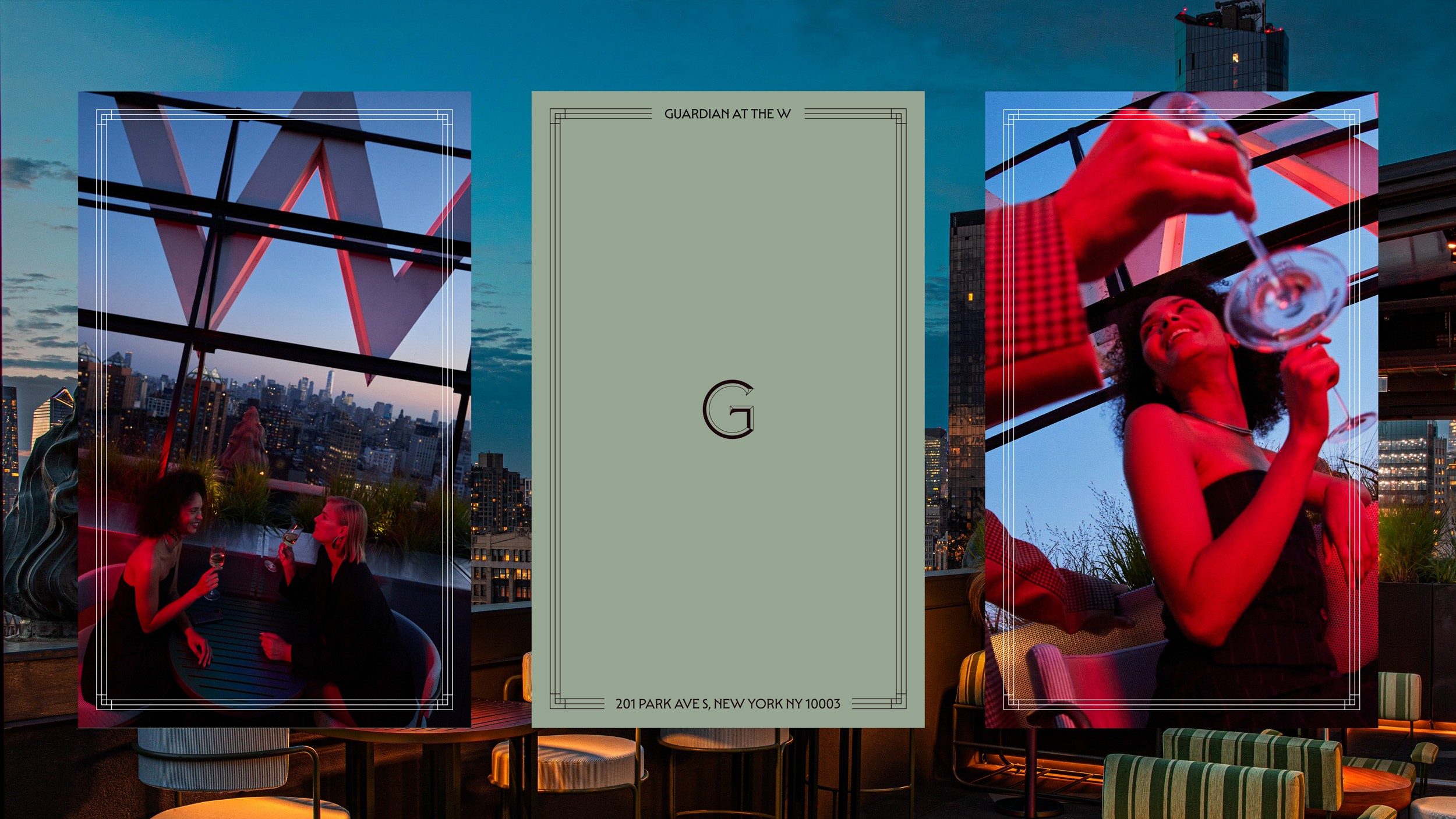
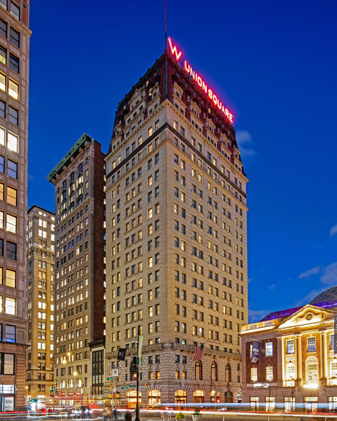
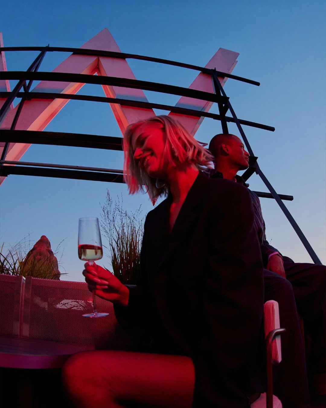
The W Union Square sits in a Beaux-Arts landmark that first opened in 1911, originally built as the Guardian Life Insurance Company headquarters. The brief was to create an identity for a new bar that already had a strong sense of place, and still hit the playful notes of a rooftop bar in a W Hotel. We drew on the building's history, its architectural details, and the specific view from the roof to build a brand that feels genuinely embedded in the property.
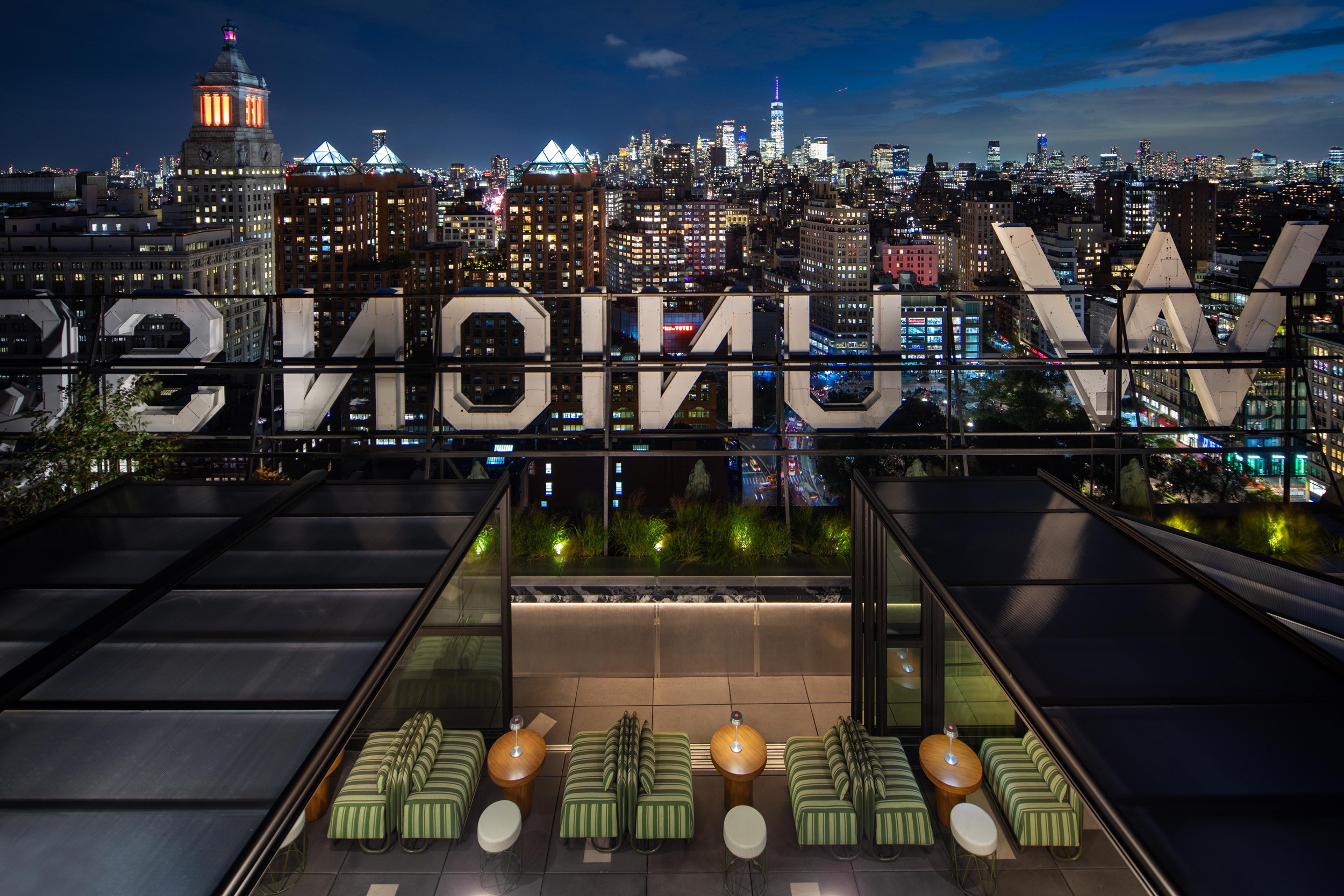
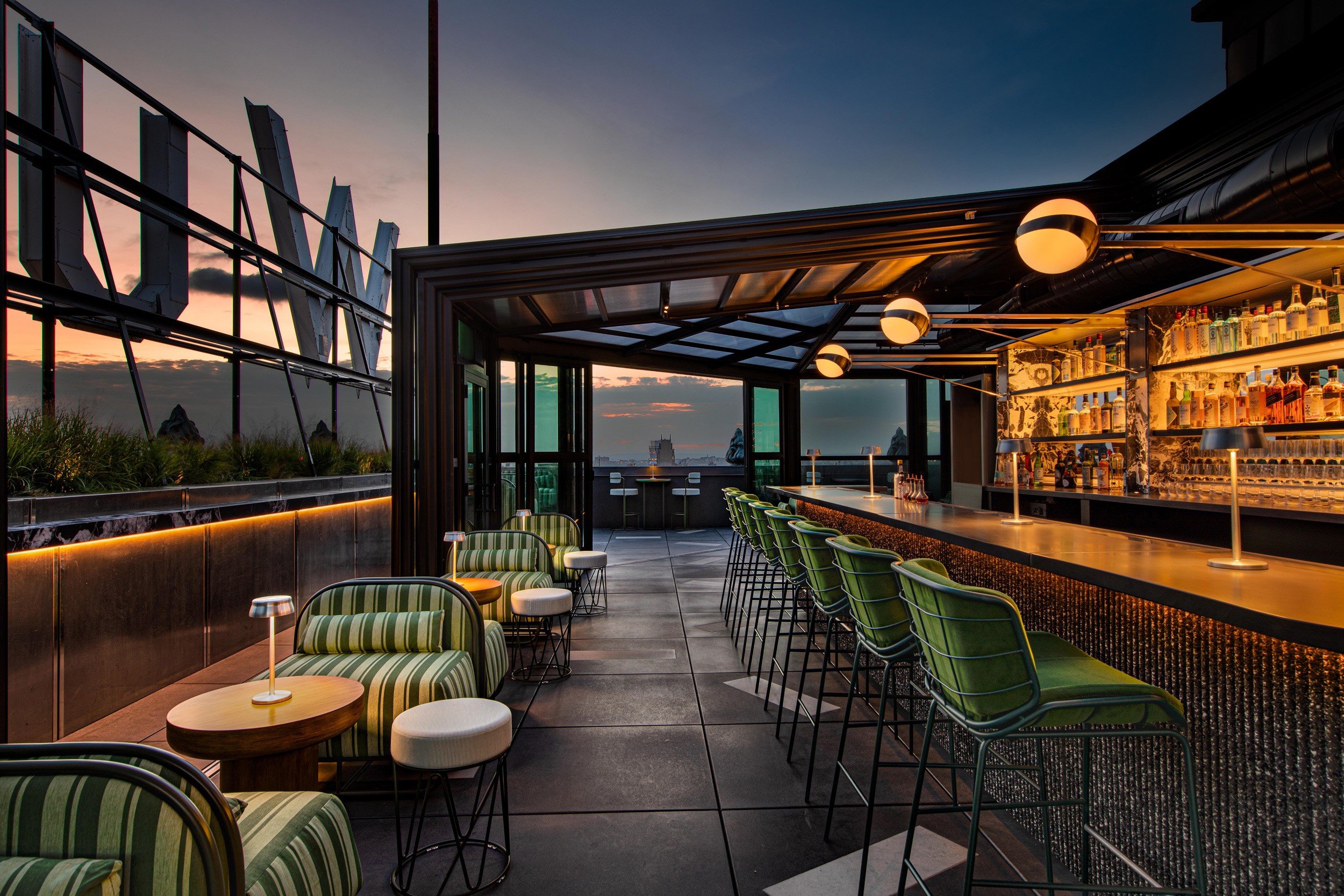
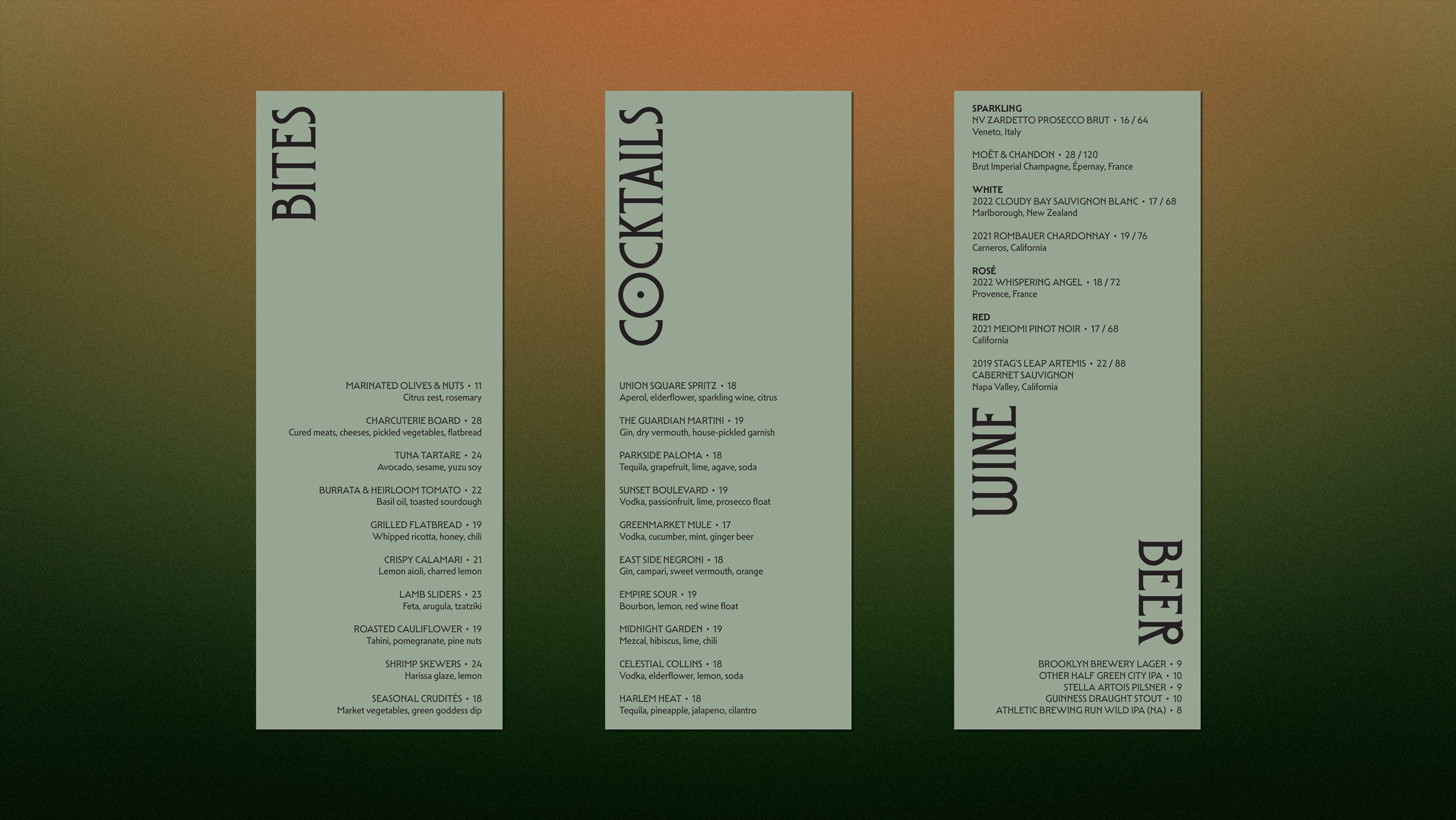
We built the color system directly from the rooftop itself. The brand gradient runs from the warm amber of the sunset and the iconic sign, through the green of the park at Union Square into the darker tones of the surrounding cityscape. It gives every branded piece a direct connection to the guest experience at Guardian, and it means the identity couldn't belong to any other bar in any other building.
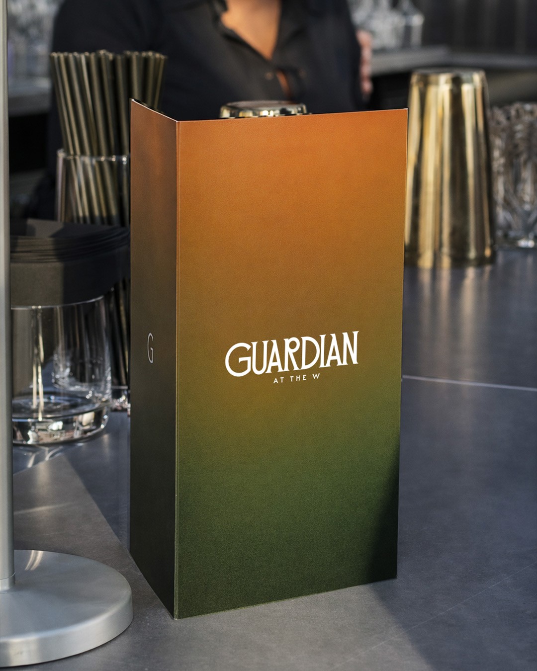
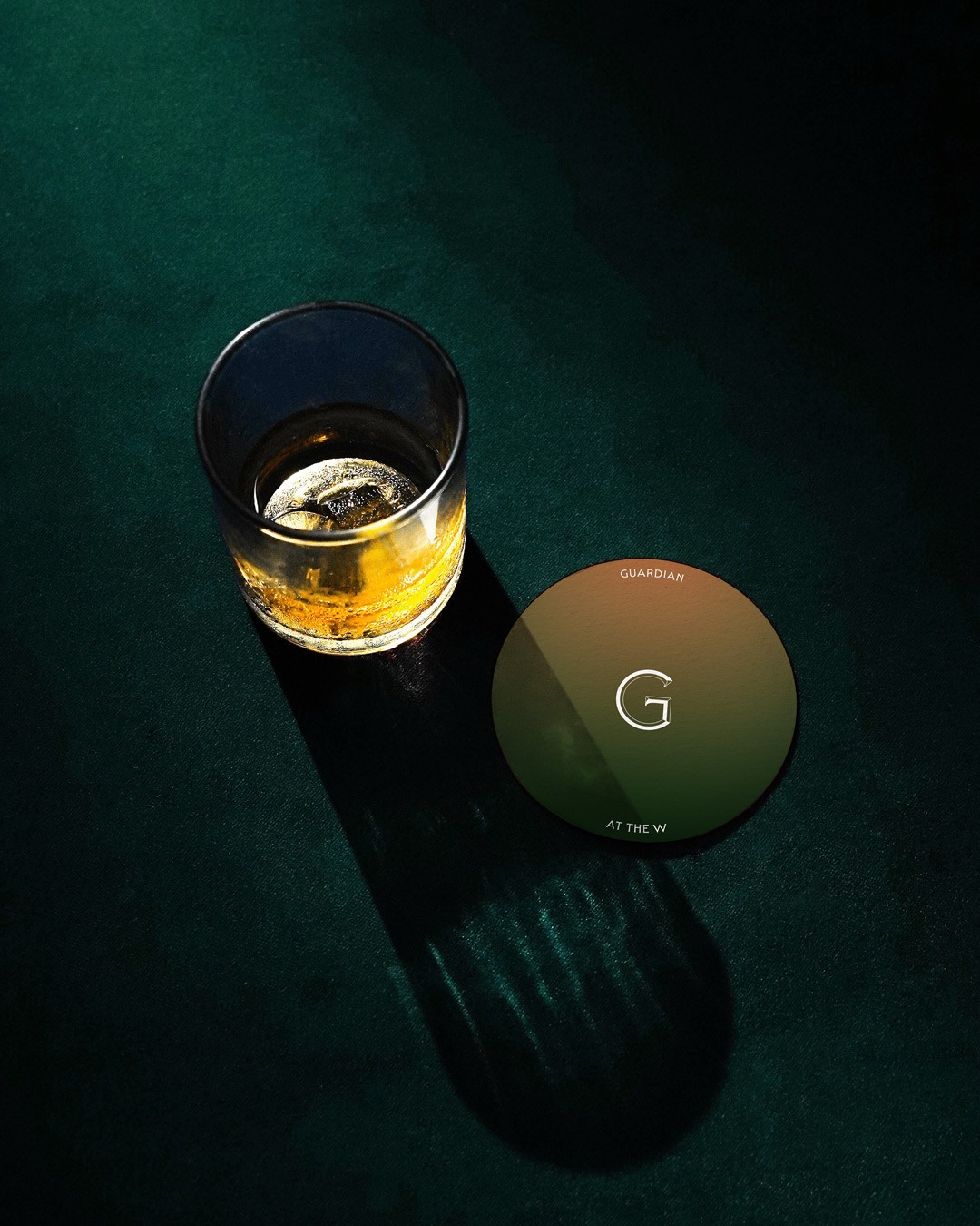
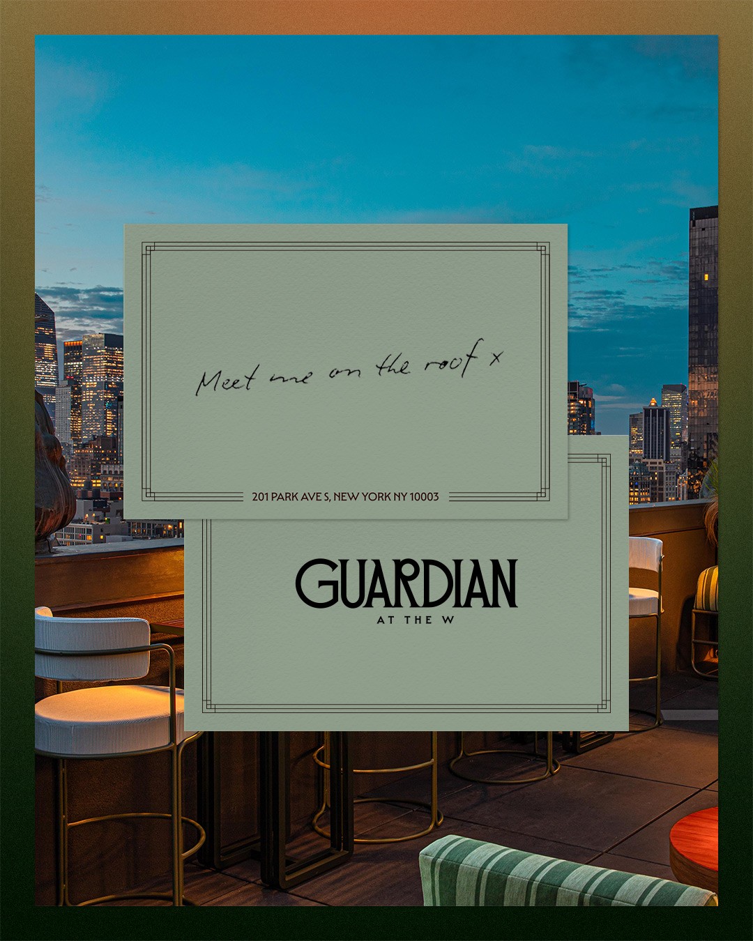
The graphic language came from the building's Beaux-Arts details. The border system is drawn from ornamental ironwork and carved motifs found throughout the original 1911 structure, adapted into a frame that runs across notecards, menus, and collateral. The "G" monogram carries that same architectural character throughout the brand.
Everything in the system traces back to something real about the property: the name from the building, the colors from the view, the graphic details from the architecture. It all started on the roof and worked its way down to the table.